Grand Slam Draws
Description
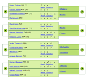 Not-so-well designed draw charts on wimbledon.org.
Frustration with the state of the official Wimbledon website and a strong urge to visualize the draws of the (then) ongoing championships resulted in me designing my own Wimbledon draw charts. Luckily, I discovered that with slight modifications, I could extend my design to re-create draw charts of the remaining three tennis Grand Slams — the Australian Open, the U.S. Open and Roland Garros.
Following are a few notes on the project’s development.
Tools
It took me all of what I learnt in last semester’s “System Tools and Programming Languages” and “Multimedia and the World Wide Web” units and then some more.
There was no straight API to get the scores from wimbledon.org so I had to go through the painful task of parsing the data out of their public HTML pages. This meant regular expressions, and what better language for those than Perl? Good ol’ PHP was already in place to serve the final design on my site, as were HTML and CSS.
Data Retrieval
While regular expressions aren’t exactly rocket science, narrowing down to the right match can get tedious. Bad HTML code quality — littering the page with nbsps; elements with no meaningful content (such as <sup> </sup>) etc. — didn’t exactly help. Neither did strange inconsistencies such as displaying a player’s full name in some places and an abbreviated version in others. I won’t complain too much though because it could’ve been worse. Also, I believe the parsing code could’ve been a little simpler (and cleaner) if I knew more of the advanced regular expression features offered by Perl.
Anyway, I was able to successfully parse the meaningful data from the HTML and convert it to JSON, so I wrote a small shell script to download and convert all data for the men’s and women’s championship draws into a much more portable format. Finally, a cron job was setup to make sure the data stays fresh.
Page Design
The whole point of this project was to design a better draw chart (and give me something to do during my break) so this was the most important bit. The most obvious semantically correct option would probably be to serve the draws as one big table. However, I have a strong dislike for the <table> tag, and let’s face it – this isn’t exactly a table now. I opted for nested lists instead. Styling those lists elegantly was the interesting and challenging part.
Recursion and Scaling
A draw chart is quite symmetrical since a particular level has exactly half the number of nodes from its previous level. This meant that effectively doubling all properties (width, margin, font-size etc.) for each node at consecutive levels should produce the desired result. And doubling those properties is all I’m doing. The actual code is much simpler than you’d expect:
li {
    font-size: 1em;
    line-height: 2em;
    width: 11em;
    margin: -0.75em 0 -0.75em 5.75em;
}
li li { font-size: 2em; }
Obviously there are a few more subtleties, but coming up with this recursive CSS was definitely the hardest bit. “Recursive CSS” — you heard it here first!
The best aspect of an em based design is that it scales beautifully. Zooming becomes as easy as changing the body’s font size, and that allowed me to provide different zoom levels without much effort.
Visualizing Tennis in Technicolour — Yup, I’m a Coldplay fan
The colours are what give life to the chart. They do more than providing make–up though.
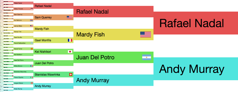
Top half of the U.S. Open 2008 men’s singles draw.
Each player is associated with a different shade (hue). While the player’s shade stays the same throughout the chart, the intensity (saturation and brightness) increases as the player progresses through each round. This assists in following the path of a particular player through the draw as well as in differentiating between various rounds. It completes the chart.
- Next
- हिन्दी Transliteration
- All
- Bits & Pieces