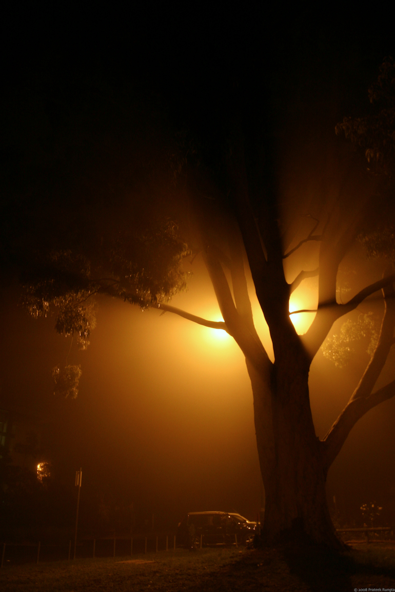
Soft light
A foggy 1st of June here in Melbourne. (smaller version on flickr)
On a completely unrelated note, for people who don’t know or have forgotten about it, there’s another section on my site — my webmarks. It’s a place where I post links to bits of the internet that I find interesting and/or worth sharing. Webmarks recently got a friends section, and I must say my friends have been posting some great links. So, if you’re ever feeling bored or need procrastination material, check them out! Alternatively, you can subscribe to the combined (me+friends) webmarks RSS feed or just my webmarks’ RSS feed and regularly find excuses to spend more time on the web ;).
Markdown yes yes, HTML no no.
- *italic*, **bold**
> Quote
- [link](http://prateekrungta.com "Rungta's")
† E-mail is required for summoning your gravatar image.
I find that it looks better if i clip the bottom quater…
Hmm, I think it looks incomplete without the base of the tree.
4:10am, 2nd Jun'08phenomenal! But I would have to agree that I find those mechanical contraptions as slight distractions to this utterly beautiful shot. But even the way it is, it’s perfect. It actually adds symbolism to it! ;)
BTW, have you used the photoshop plugin/standalone version of Neat Image? You should definitely give it a try - you can custom eliminate the high-iso noise perfectly with it…
But seriously, dude, beautiful photograph! The play with the light is phenomenal.
5:12am, 2nd Jun'08Yeah seriously great photograph. One of your better photos in recent times I would say. I only wish I did not have to scroll down to view the complete image, breaks the whole ‘flow’ thingy.
8:54am, 2nd Jun'08Wow! Excellent use of backlight. It looks kinda spooky
2:28pm, 2nd Jun'08have you used the photoshop plugin/standalone version of Neat Image
Gave it a try yesterday and worked beautifully. Too bad their free version works only on images up to 1024 pixels wide or tall.
I only wish I did not have to scroll down to view the complete image, breaks the whole ‘flow’ thingy.
It does, but haven’t got much of an option there.
the top of the image looks like out of a fairy tale..
And the bottom brings you back to reality! :)
good luck with exams by the way
Thanks Siavash, and good luck with your exams too!
6:38pm, 3rd Jun'08Pretty Pretty.
Wow. I always get to keep Microsoft away while commenting on your blog
2:13am, 5th Jun'08Awesome photograph! The lighting is simple superb. Looks so surreal…till we scroll down to the bottom.
6:54pm, 6th Aug'08
Souvik said..
Hey Rungta… I really like this pic. But I find that it looks better if i clip the bottom quater, ie the area that has the cars and dence etc…
3:21am, 2nd Jun'08