Not so Yellow
Description
Twitter is great. Definitely my kind of social network.
As good as it is, the current web interface does not make it easy to browse historical data. Anything older than the latest 100 or so tweets requires a lot of clicking and manual scanning. Their search too, understandably, only covers updates spanning back a week or so. Anyone who’s tried to revisit their tweets from an year or a couple of months back has surely felt the pain.
There had to be a better interface for browsing tweets. What surprised me, though, was that no one had created such a service for the nostalgic folk on Twitter. I did come across a few custom solutions: Doug Bowman (the design lead at Twitter) for instance, set up a WordPress archive; Andy Graulund built a custom LAMP app.
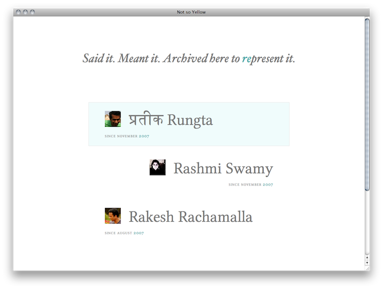
The idea of my own Twitter archive appealed to me, didn’t sound like a massive amount of work, and out came Not so Yellow.
Design
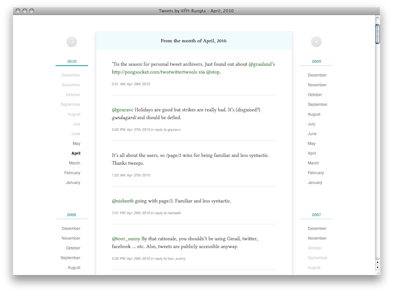
This project was the result of my grievance with browsing old tweets. Before anything else, it had to have a super easy interface for getting to tweets from any specific month or year.
I toyed with several ideas: listing all the years and months upfront; as drop–down menus / expandable lists; months from the current year upfront, with the full list on a separate page or down below; and, side by side.
As you can see above, I ended up adapting the side-by-side option. This design keeps the content (tweets) centrefold and topmost in the the visual hierarchy, and the year and month links as second-class citizens. Yet these navigational links are persistent and always available as soon as they’re needed.
Short Abused URLs
URLs are important. URLs are part of a site’s design. Cool URLs don’t change. An unfortunate consequence of Twitter’s awesome 140 character limit has been the blown-out-of-context URL shortening craze. While these shorter links definitely do a great job of conserving precious tweet characters, they are usually less readable, obfuscate useful information and — as was dutifully demonstrated by tr.im — provide little guarantee against massive link rot. They should, in my opinion, be used sparingly, only when absolutely necessary.
Well, here was a chance to do something about the shortened URLs under my control. And something I did. It wasn’t as straightforward as I hoped though.
My initial plan was to simply follow and look for redirects for all incoming URLs, and replace the tweeted link with the address of the final destination. Turns out:
Some tweets use URLs for more than providing a link. Altering them can effect how well the tweet reads.
Some redirects are temporary (in not just the HTTP response code).
Some URLs change and lose their original meaning.
http://rungta.muxtape.com redirects to
http://muxtape.com.
Sad but true.Some uncool URLs redirect to soft 404 pages.
http://tinyurl.com/6xqx42 expands to
http://www.ibnlive.com/olympicsnews/abhinav-bindra-wins-olympic-gold/70827-29.html
which, instead of pointing to the correct new location
(http://ibnlive.in.com/news/abhinav-bindra-wins-olympic-gold/70827-29.html)
redirects to http://ibnlive.in.com/missing.html.URLs can become really long and unreadable.
http://youtube.com/watch?v=lCrJRgzTBCE redirects to
http://www.youtube.com/index?ytsession=ODBr9ZffIdpph2UHiTlWOwoUUUHyBDlIvBvoQs5JS4jkKj40n5WuEgv-NU6hwEcaBCT-Oz8cA0VOZtxWTlaV5WzhWef8KsewHvt_CvZEfG6P5HsgM0c1E3UZvMIJNAUbZs0i2XnAsLn6THeHgqh3tEL_7RwbprFc4F-iGlRiFKdjAI2ObVjg1eE2h3rjf3zobuvf_6gUB56w16y-3IIzMsIBMQwRhVmXC3fXUVgxMuIpfbNjYtwymuiT9uh0LUjxv0eALEZtdp2oDA-1-XvKEDRj5MMMfSfPt1EZ8K-uccYWNI6pWML8SpXG3pFTZebqq97SGhWVemzur-NiUlels1BHBeLBjhJ-9WNTCFDPCIJNh1G0RrXvyYQ8zhLhgygYDYUshxYPy_4
(this example courtesy of Bernie Ecclestone).
So, I scratched my URL replacement plan and decided to provide inline expansion, similar to the ‘(expand)’ short URL suffix on Summize (now search.twitter.com). Expanded URLs, when applicable, are added to the tweets as [+] links.
Tooltip via the generated CSS content:attr(href) property.
No JavaScript.
The fully expanded link addresses are displayed as tooltips when the mouse moves over [+]. Thus, a user has the option to simply click the original short URL or preview and directly click through to the final destination.
Should, Could, Would
- Should
-
Search, obviously.
- Could
-
As Rakesh graciously pointed out, this could be opened to support any user, and do for Twitter what Justin Ouellette’s ihardlyknowher does for Flickr. Not so Yellow does archive tweets from multiple accounts (and can support a few more), but it wasn’t built as a public service.
- Would
-
Perhaps at a time when I haven’t got 4 other projects stretching me thin.
For now, if you’re interested in archiving and/or browsing through your own tweets, take a look at Doug Bowman’s instructions for WordPress. Alternatively, download and install Andy Graulund’s well designed, fully featured, open source LAMP project Tweet Nest. Or ask me nicely.
Credits
- Body text typeset in Linux Libertine (GPL) and embedded using Font Squirrel’s excellent @font-face Kit Generator.
- Rashmi Swamy for coining “not so yellow”.
- Phil Sturgeon for the CodeIgniter cURL library.
- Rakesh Rachamalla and Rashmi Swamy for feedback, help with testing, and their tweets.
- Previous
- CodeIgniter Libraries
- Next
- Instagraphy
- All
- Bits & Pieces


