Maintenance
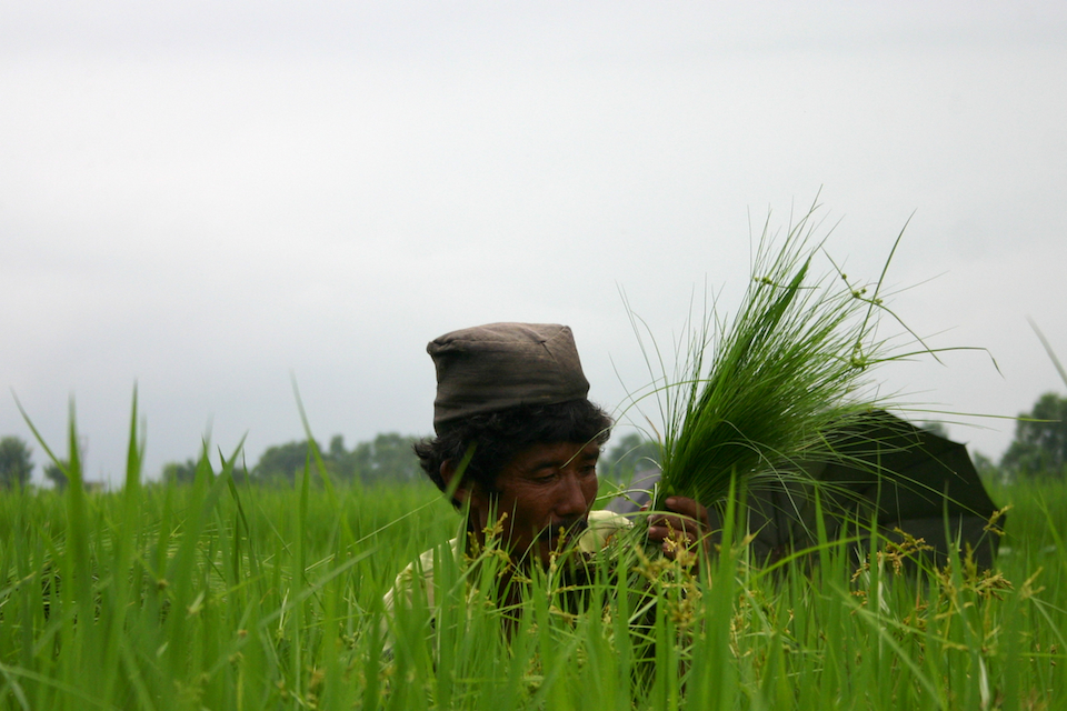
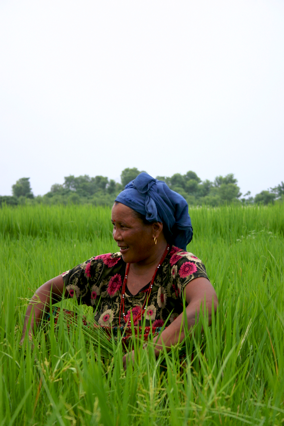
The farmers of Sauraha tend to their rice fields.
They know that a good harvest involves more than just sowing seeds. They know the importance of clearing out weeds and outgrowths, of letting their crop flourish. Wise folk.
Very few might remember this, but Rungta’s actually started out as a desktop wallpaper site. It was a move heavily inspired by the work of one mandolux. Soon after launching though, I found out about photo blogging and discovered a whole community of photo bloggers over at Photoblogs.org. A photoblog felt right in every way that the short-lived wallpaper phase did not.
Out came version two. It had all the usual suspects: a single photo per page, previous/next navigation, captions, comments. Much of the blog’s content and information architecture remains the same to this day.
The third and most recent redesign went live with the 100th post. Aesthetics were the primary concern this time around. Wider photos, subdued colours, fewer distractions.
It served this blog long and well. So well that I have decided to preserve the design for all older posts. Yet four years and 99 photos later, it was time for me to use the farmers’ wisdom.
Here with the two hundredth photo launches the fourth major redesign of this blog. Where the third design focused on aesthetics, this one focuses on usability. Adaptive widths, stronger contrasts, better typography.
I’ve been calling it Clarity internally. Hope it lives up to that name.


Comments
Souvik Das Gupta
So Rungta is on a shipping spree. And the redesign I super-like. :)
1:58pm, 9th May'11
Varenya
Good work!
2:22pm, 9th May'11
Rashmi
How can this not call for a long comment from me. Get ready. :)
Following all the stages of your photoblog, this site has been a constant source of learning for me, the past 6 years and counting. And not only in terms of photography.
I remember a conference call around the 100th post redesign where Nag and me wanted the (then only) maroon background to go away and now that it’s gone, it’s a mixed feeling. Glad you’ve kept the look of the old ones the way they are. Comments on some of those posts also carry memories of our growing-up years there.
That said, love the emanating feeling from this new design (esp. with the text feature). Almost representing a new harvest. Clarity, in-hand with simplicity, is what we all work towards for. Keep the shipments coming.
7:12pm, 9th May'11
Rakesh
This has been a long time coming! Glad you’ve pushed it out, although I secretly wished the old design would stay (with minor tweaks) because it worked so well for so long. I bet it was tough letting go (and I bet you’ll come back to it in some form some day), but this new one’s great – I’d think the new layout works better for different crops and long form text?
Typography is loads better. I wonder if you could bring the number of typefaces down to two. White on black text is way more legible, but again, it’s not like your previous design was an eye sore. Time will tell, but I like it already. Keep shipping!
3:20am, 10th May'11
Nidhi
Oh! I thought I’d miss the old design…but I like this one too!! :O Good work! Glad you kept the old, though! :)
6:18pm, 10th May'11
Prateek
Glad that you are all liking this design. Knew my visitors were a smart bunch!
I’ve lost count of the number of times I branched back towards the old design while moulding this one. It was always the colour scheme. Ironically, that’s what proved extremely hard to get right, leading me to abandon all those experiments. Hope to revisit and resurrect that design one day when I’m a better designer.
There’s definitely room for constraint, but three hopefully isn’t too indulgent.
A little surprised with the unanimously positive response to my decision about preserving the older design. Guess I wasn’t the only one attached to it.
10:49pm, 10th May'11
Your Opinion
[link](http://url.com)
Markdown yes, HTML no.